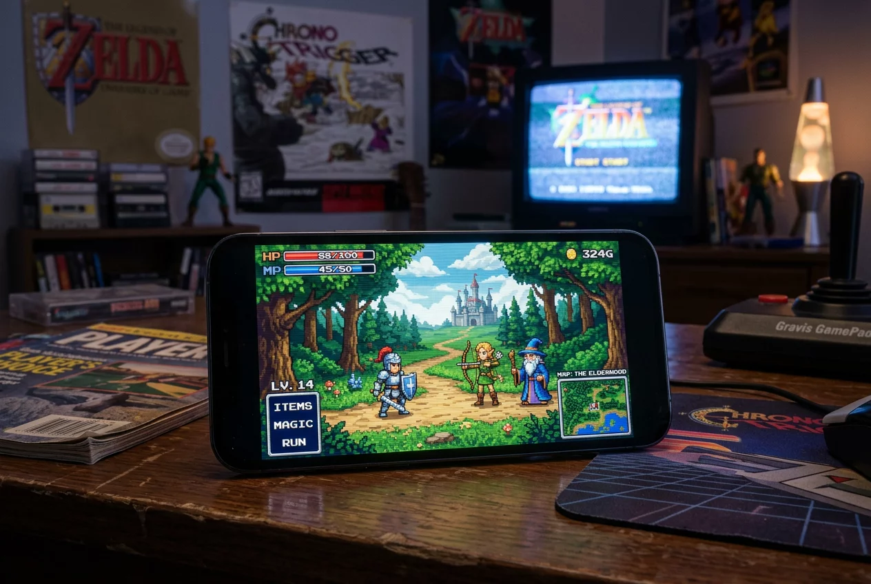
When you power on a Sega Mega Drive, the first thing that hits you isn't just the speed: it is the moody, high-contrast aesthetic that defined an entire decade of gaming. Unlike its competitors, Sega leaned into a grittier, more industrial look that felt mature and edgy. This was not accidental; it was a byproduct of how the hardware handled its limited 16-bit color resources. To understand the visual soul of the Mega Drive, you have to look past the pixels and examine the palette.
The Master Palette vs. On-Screen Reality
The Sega Mega Drive possesses a master palette of 512 colors. For modern users accustomed to millions of colors on a smartphone, that sounds like nothing. However, in 1989, it represented a massive jump over the 8-bit era. The catch was that the VDP (Video Display Processor) could only show a maximum of 64 colors on the screen at any given time. These colors were organized into four palettes of 16 entries each, where the first entry of each set usually served as transparency.
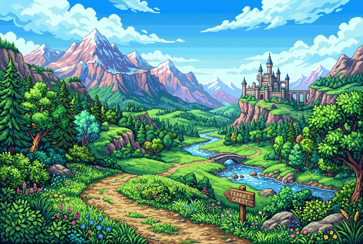
Artists had to become masters of shadow and light. They used a technique called dithering—placing alternating pixels of different colors close together—to fool the human eye into seeing a third, intermediate transition color. On an old CRT monitor, these dots would bleed together, creating smooth gradients that the hardware technically couldn't produce. It is this crown of ingenuity that truly defines retro visual design.
Coping with the Contrast
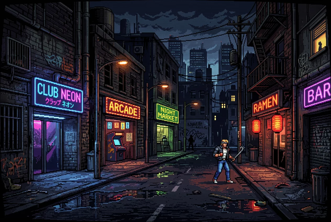
The Sega palette is often criticized for being "darker" than the Super Nintendo's 32,768-color selection. But developers turned this limitation into a strength. The deeper blacks and sharp highlights were perfect for the sci-fi corridors of Phantasy Star or the gritty streets of Streets of Rage. By focusing on high-contrast art, games achieved a cinematic depth that felt miles ahead of the flat, brightly colored worlds of previous generations.
- Palette Swapping: A clever trick used to create different enemies or times of day without using extra memory.
- Raster Effects: Changing palette data mid-frame to simulate water transparency or atmospheric fog.
- Shadow/Highlight Mode: A rare hardware feature that allowed pixels to be darkened or brightened, effectively doubling the color count for specific effects.
Playing these games online today via emulators often reveals the raw pixels, but to see them as intended, one must appreciate the "fuzzy charm" of composite video signals that smoothed out the 16-bit edges. This visual fidelity wasn't just about the numbers; it was about the art of making 64 colors look like a thousand.
Technical FAQ
Why do Sega games look different on modern TVs?
Modern screens are too sharp. They show the individual pixels that were meant to blend through analog signal interference and CRT tube phosphor decay. This makes dithered patterns look like checkers rather than smooth shades.
Was the limited palette a disadvantage?
While it made smooth skin tones difficult, it excelled at metallic surfaces, mechanical designs, and urban environments, giving the Mega Drive its distinct "adult" identity compared to more cartoony systems.
Retro Discussions
This could be your first comment. Share your thoughts on 16-bit graphics!
Leave a Comment